Wednesday 30 October 2013

FLASH! Mark Cohen and Bruce Gilden inspired!

I have an infatuation almost with these two photographers Bruce Gilden and Mark Cohen. There hard use of flash and close up frames of body parts and portraits in the street and their amazing use of film!

I decided I wanted to know their secret so I research them until my head was buzzing with information and idea's and I just had to give these new techniques a try!

I went out into the streets at night and this is what I came up with!


My Final Images! Choices Choices!

So here are my first initial ideas for my final images!

Colourful, Yellow's and Blue's worked fabulously together! This lovely young man will be my authentic straight up final image!


LOVED this T-shirt! and her awesome red hair! Lovely close up and she shall be my fabricated final image!


The beautiful Katie! She was an exceptionally co-operative model running in and out of 'Costa Coffee' to get changed from one outfit after the other haha! This will be my manufactured final image!

Other possibilities I considered!


The Unseen Eye - Book Review


The Unseen Eye
Photographs from the unconscious
W.M Hunt
The Unseen Eye, by W.M Hunt is an inspiration to the world of photography, portraiture in particular. The book is full of interpretive photographs and portraits by a wide range of photographers, such as, Gary Knight, Cindy Sherman, Andy Warhol, Weegee, Martin Parr, etc.  I really enjoyed the darkness in the images which most of them portrayed and I'm sure we've all heard that ‘eyes are the windows to the soul’, this book is all about hiding these windows and shielding them from the camera.
 The preface reads,
“The eyes are all somehow obscured, veiled, hidden, blocked, averted or closed”. This is just a simple explanation to exactly what is shown in the book.
The front cover image is of a gentleman leaning solemnly against a dark wall, plain t-shirt on, glasses hanging around his neck and of course, his eyes are ever so gently closed. Within this book there are 369 illustrations, mostly black and white. The images throughout have extraordinary range from start to finish, which is what I love most. The preface tells us what is going to be within the book itself, telling the viewers that it is a series of images collected over many years with one thing in common. Some of the images are somewhat disturbing, frightening and even a little bit demonic, whereas others are simple, innocent and easy to intake.
            The strongest points of the book is how Hunt has very cleverly tied all these images together by pin pointing that one special element of hiding the eyes showing how it has been done and keeping it all fluidly relevant to each other. There were times where I just wanted to know what the photographer was feeling or thinking whilst creating that image as there wasn't a lot of explanation but this allowed me to create my own opinions which is always what the photographer should do.
           There was a lack of flow with the order of images with which photographer shot which image, it was quite hard to remember and image that you liked and who it was by so by the time you had read on a few pages and read that many more names and seen that many more images, you had forgotten which photographer did which picture that you may have liked!
Despite the lack of uniformity of the photographers, the book still has that real captivating flow to it. The book by Hunt most easily has more images than words. There is limited text and it’s straight to the point. E.g. this is the photographer, this is the title and this is the year. Simple and all you really need to know, let the image do the talking!
            All in all it was a brilliant and engaging book to view, plenty going on, lots of research to be found in this book and also a great sense of technique to be learnt from it.


Friday 25 October 2013

Uncommon Ground Land Art in Britain Exhibition Review

Uncommon Ground
Land Art in Britain
1966-1979
Uncommon Ground: Land Art in Britain is a touring exhibition that I visited in its new temporary home inside the National Museum Cardiff, where there are 1-5 different levels where exhibitions are showcased, museum exhibitions are located and many different information sources are to be found. The museum itself holds 500 years of all types of history including art from Tudor times to the present day.
Uncommon Ground is showcasing in the National Museum Cardiff from 28.09.2013 – 05.01.2014. The exhibition is a group exhibition with artists who are considered

“The most important British artists of the last 50 years”

This is printed onto the front of the leaflets for this particular exhibition and I immediately wanted to see what was so important about them!
Artists include Tony Cragg, Antony Gormley, Susan Hiller, Richard Long, Keith Arnatt, Hamish Fulton and David Nash.

The show was organised and is being curated from the Arts Council Collection and can read more about it here at:

http://uncommonground-artscouncilcollection.org.uk

          My first initial thoughts on the exhibition were thoughts that unravelled the longer I spent really looking at the images and the art that was being displayed on the walls and on the floors. This was a very visually demanding exhibition and was also a very textural display. The exhibition consisted of bright white walls, very clean, and masses of empty spaces around all of the work and the surrounding areas of the exhibition rooms itself and the most beautiful wooden floors. It was split into two halves, one half being in one side of the archway and the other on the other side. Walking into the big simple room I was greeted by an extremely large circle of stones, forming a very neat and
very simple circle in the middle of the floor of the first room which was created by Richard Long in 1972 and consisted of 61 stones in total.

           The room itself was very easily directed and all in all was a very visually leading exhibition. Although there was no exact route to the work being shown I was never really wandering around trying to find something to look at because there always was something. Wall after wall there was another image or another piece of visual art to look at and interoperate and the room being very bright and plain kept the mind from wondering. Something that really caught my eye was the huge font stencilled onto the white wall of the second room, big blue title of the exhibition and the dates. I have never before seen this in any other exhibition so far and really enjoyed the scale of it.

            Disadvantages of the exhibitions was that the visual art of the show was very tempting and inviting to touch and yet was restricted from doing so by small labels, signs and barriers to prevent any touching of the exhibition itself. However this allowed the mind to be completely teased by the ideas of what it could possibly feel like and having to leave without ever knowing the exact texture to it.
Inside one of the rooms there was a small but bulky television sat on top of a thick white rectangular podium. This screen was showing a slideshow of images but what really got me thinking was, why have they chose to use a big, bulky and outdated television instead of the slim sleek screens we are all so used to these days. I finally agreed on the fact that using a modern flat screen simply wouldn’t have the same effect at all as this big bulky screen did. I also thought about travel and transportation of the screen, if it is to be moved around from place to place it is less likely to be damaged because of the amount of outer protection it has.
The rooms had incredibly high ceilings which carried sound through to the other room therefore it was an extremely quiet environment allowing thoughts to hatch. One thing that I really admired was the spacing around the framed images. Some images were framed with a thick black boarder, some had a white one and some had a grey one. The exhibition had an earthy feel to it but also didn’t overpower the viewers with economy views or beliefs in any way it was more subliminal and subconscious feelings that the photographs and their surroundings portrayed.

              The work itself included a range of sizes of prints most of them had incredibly large spacing around the images which were drawing the eyes into the image closer. This technique of engaging the viewer with the image intrigued me very much as I didn’t realise that a simple frame with space around an image could draw so much attention to the image itself. I also liked the simplicity of the information plaques located at the side of each image and 3D artefacts. A simple plain white plaque with small yet simple font was just enough information to let the viewer know exactly what was happening in the image or 3D visual. The prints were very flat against the walls with shallow frames which allowed a great deal of light onto the images making them clearly visible. However on the 3D artefacts the spot lighting was angled in a way that the shadows that were being cast really complimented the details that were obviously trying to shown.

                The audience is a tricky one to pin point with this exhibition. I felt that it was not aimed at minors in any way as it was too open and blank and not very visually engaging for younger viewers. I felt that it was much more aimed towards the older generation and art students which were generally the kinds of people attending this exhibition. Overall I really enjoyed the exhibition as it was a real awakening experience to the beauty that is around us every day in nature and how to capture this beauty. The artists really portrayed a wonderful sense of earthiness and pure rawness of the nature filled shots. The exhibition maybe could of gave a little bit more away in the sense of texture as I left the museum wondering what exactly that 3D artefact of the stone canvas felt like but all in all it was a beautiful display of photography and 3D art.

Tuesday 15 October 2013

Street Strangers Straight Ups!


So this is my first lot of images of strangers I stopped in the street to pose for my straight up project...(try saying that whilst drunk!) These were lovely random individuals that caught my eye whilst wandering the streets of Cardiff! It was a lovely sunny Wednesday and this is who I found! 
Sunglasses....and a beanie!? Whaaat?

Lets take off the shades and pull a Robert Frank?

Sunglasses and an incredibly cool 'Walking Dead' T-shirt!

Now pose?

Andddd  quick close up of that shirt..I mean...pretty face!

Anybody noticing any colour co-ordination here?? hair matching the gold metal background maybe??

Now lets hide that pretty face and strike a Robert Frank again please!

Beautiful style sense and lovely..oh look Sunglasses!

Lovely little innocent pose to top it all off!

Sunday 13 October 2013

Baz Luhrmann - Everybody's Free To Wear Sunscreen


This is my new up lifter for life! Truly inspirational manifesto by Baz Luhrmann - Everybody's free to wear sunscreen!

Welcome to UNIVERSITY!


WOW !! Uni life is really hitting hard now, so much work and so little time...My desk is a MESS, my floor is covered in paper and my laptop feels as if it's about to EXPLODE it's that hot!


Lots of cutting, sticking, organising, editing and shooting is being done!!

Juliet and Tony's perfect wedding day!

All ready to go in and wait for his auntie to come down the isle ! Waiting ever so patiently with his marvellous hat!

This little fellow nearly stole the show at Juliet and Tony's gorgeous sunny wedding!! He was such a lovely well behaved little guest and followed me around with amazement and wonder...think there's a little photographer in him to be found!
Waiting in suspense Tony and his wonderfully behaved grooms-men!

I fell in love with these stunning bouquets made out of coloured foam! How creative and wonderful!
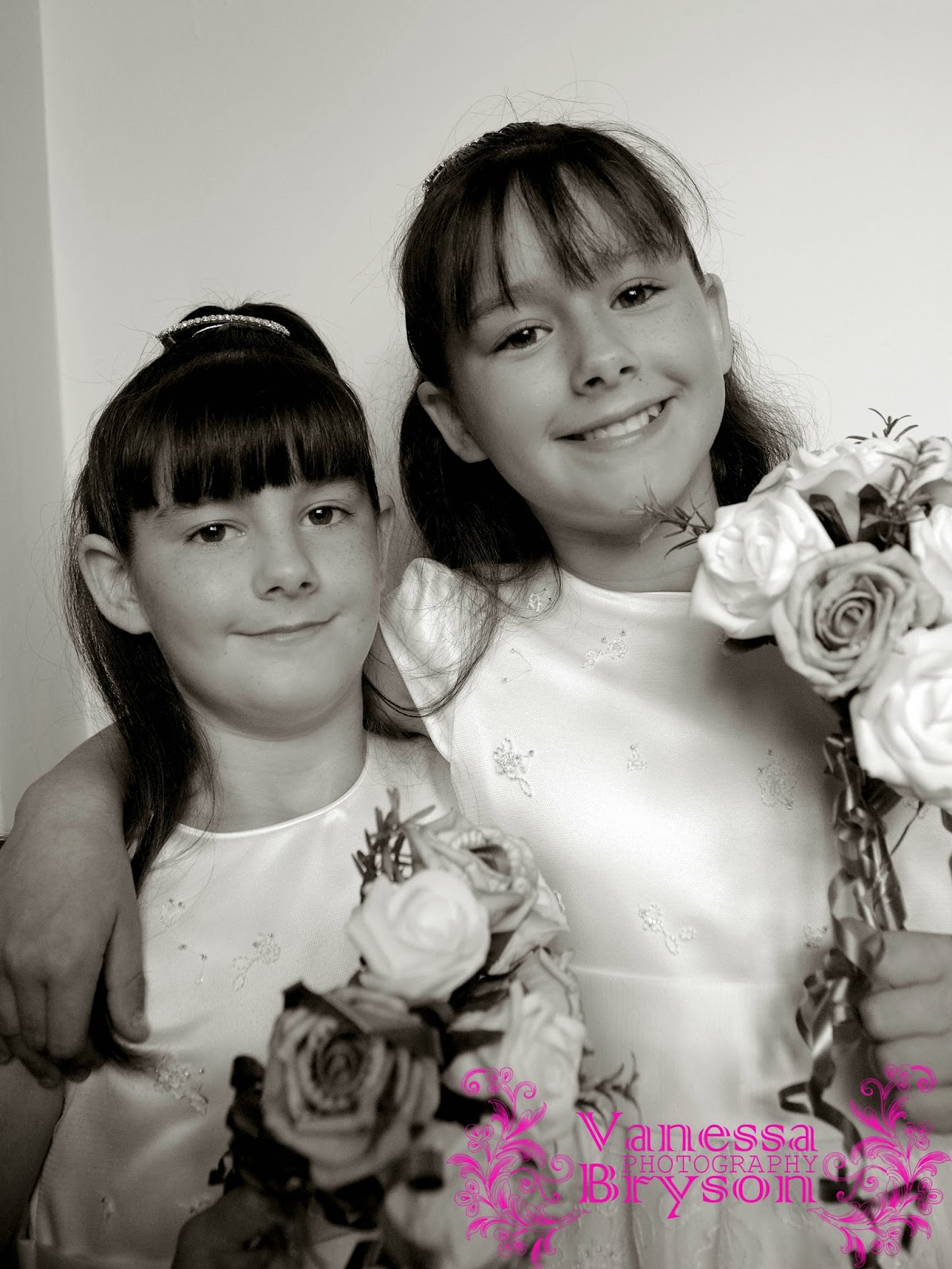

The chatterboxes!

A look of sheer beauty, nerves, and a lifetime of excitement! Juliet was one of thee most nervous brides I have ever had the pleasure of photographing! She looked simply stunning as she floated down the isle to her wonderful loving husband Tony!

Time to go! Lovely tiara and pearls...they made excellent little detail shots! 


Attention to detail is my most prized talent! It is impossibly for me to go to a wedding (or anywhere in fact) and miss these beautiful little things that show the real time and effort put into a beautiful wedding! This beautiful dress was designed personally by the dress and she did NOT want the little details and sparkly bits to be missed on her perfect busy day!


Sometimes the bride just falls into those pure moments of thought and I am there to capture these gorgeous little life reflection moments! 


Fabulous lighting in that hallway! The shadows gave off a very vintage and fashionable effect on Juliet's stunning dress!

One last glance before she enters to meet her beloved hubby to be!

Grandma's face says it all...proud proud moment for all of the family that day, a wonderful catholic ceremony and lots of family and friends to share their day!


Congrats to the newly weds!

Little bit of champagne anyone??

Always my favourite part of the day to capture the bride's true smile and to remind her of how wonderful her day has been!

A look of sheer happiness and love!


Absolutely LOVE the detail in this dress...no way on earth was I missing these creative shots to capture the stunning time and effort that has been hand sewn into this dress!


Quick re-touch of the make-up before some more portraits!


Sometimes you just NEED this glamorous dress shots to make an album! 


I can never resist a good veil shot!


A very happy Groom! 


Best friends make the best photos! the love between these two was phenomenal! they were practically sisters!


Altogether now!

No matter how hard, how busy, stressful or hard life may get....we will always have each other...hand in hand we go!

LOVE these busy little moments before the group photo's! You never know what you're going to capture!


Bride and Groom...Juliet and Tony...May you're lives be full of happiness and love!